Production Lines Monitoring App
Product design for responsive web app (RS Components)
Category:
Responsive Web App
Technologies used:
Sketch, Axure, Miro, Photoshop, Illustrator
My Contribution:
UX Research, UX Design, UI Design, Branding
Project Overview
The Factory Monitoring Responsive Web App was developed for RS Components to provide real-time monitoring of factory production lines through IoT sensor data. The system tracks vibration, sound, temperature, humidity, and other sensor inputs to detect malfunctions and predict maintenance needs. The platform enables users to visualize and analyze sensor data, receive alerts on potential failures, and optimize maintenance cycles. Designed as a responsive web app, it offers a seamless experience across desktop, tablet, and mobile devices.
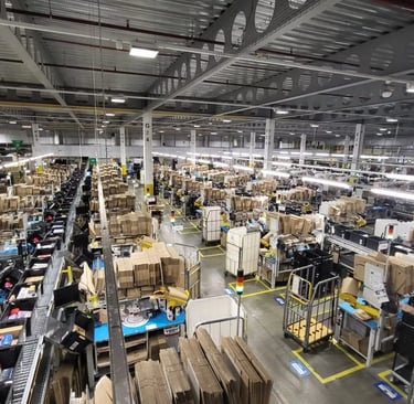
Factories rely on reactive maintenance, leading to unexpected downtime and costly repairs. Without real-time insights into production line performance, businesses struggle to anticipate failures and optimize maintenance schedules.
The existing systems were fragmented, lacked intuitive visualization tools, and were not adaptable to different screen sizes.
Problem Statement
Goal
The primary goal was to design a responsive and scalable web app that allows factory operators and engineers to:
Monitor production lines in real-time using IoT sensor data.
Receive automated alerts when machines show early signs of failure.
Optimize maintenance schedules based on predictive insights.
Customize dashboards and configure visualizations based on their specific needs.
Ensure seamless usability across desktop, tablet, and mobile.
Key Responsibilities
As a Senior Product Designer (Contract), I was responsible for:
Conducting contextual inquiry by visiting factory sites and observing operators using existing systems.
Spending time on-site in factories, interacting with operators, maintenance teams, and managers to fully understand real-world workflows.
Leading user interviews with factory operators and engineers to gather insights on their daily challenges.
Facilitating and participating in workshops with stakeholders and subject matter experts to align business goals with user needs.
Designing user flows and wireframes to streamline interactions and enhance usability.
Creating a responsive UI for web, tablet, and mobile that provides clear, actionable insights.
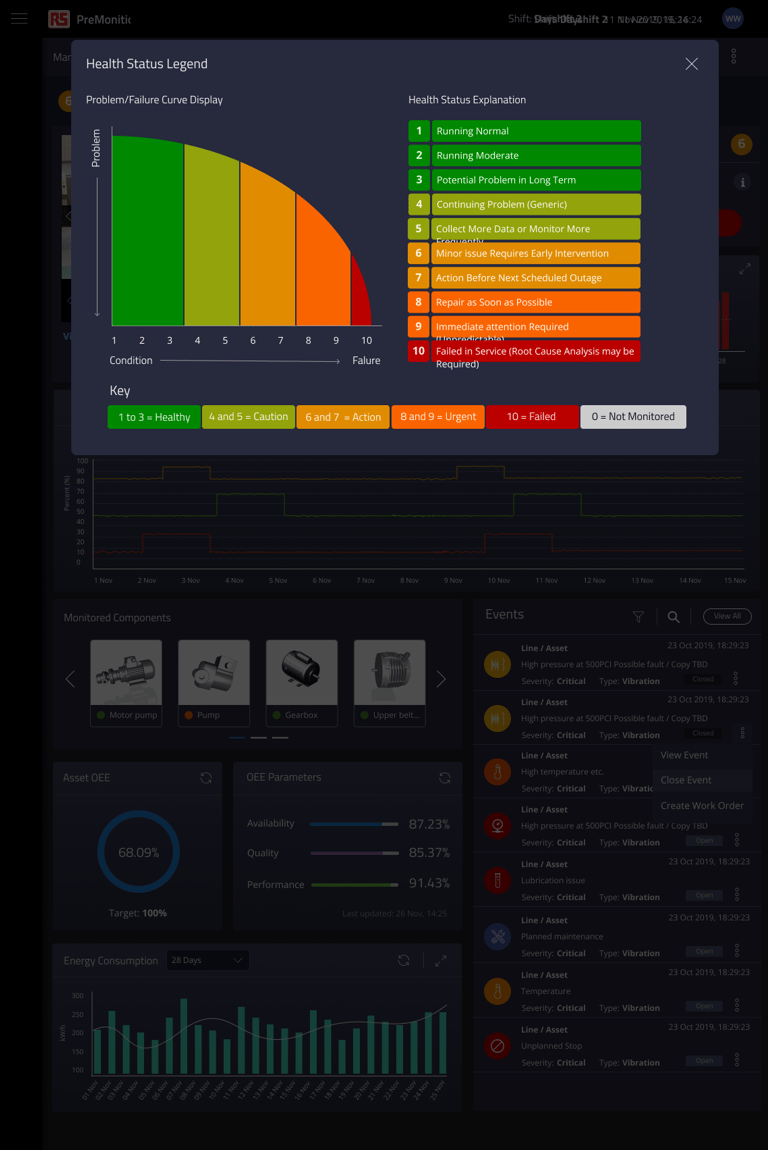
Developing a colour-coded item health state scale and an alerts matrix to visually indicate equipment conditions and prioritize maintenance actions.
Delivering all design assets independently, ensuring high-quality execution from research to final UI design.
Research & Discovery
User Interviews – Understanding Pain Points
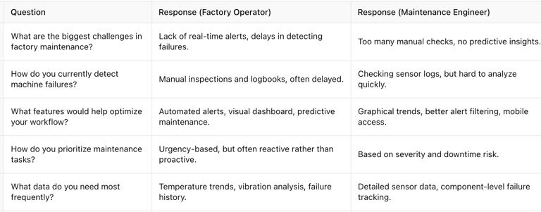
We conducted interviews with factory operators, maintenance engineers, and shift supervisors. Key insights included:
Operators struggled with delayed fault detection – They needed a clearer alert system that could highlight faults before major failures occurred.
Engineers requested predictive maintenance tools – They wanted trend analysis and failure prediction based on sensor data.
Supervisors needed centralized dashboards – Managing multiple production lines was challenging due to disparate monitoring systems.
Contextual Inquiry – Factory Site Visits & Observations
During our on-site visits to factories, we observed how maintenance teams interacted with their existing monitoring systems. We identified several key pain points:
Reactive maintenance issues: Workers often discovered machine faults only when production was already affected, leading to costly downtime.
Lack of real-time alerts: Many operators relied on manual inspections and logbooks, causing delays in addressing issues.
Complex data overload: Existing systems presented data in overwhelming tables and raw logs, making it difficult to interpret.
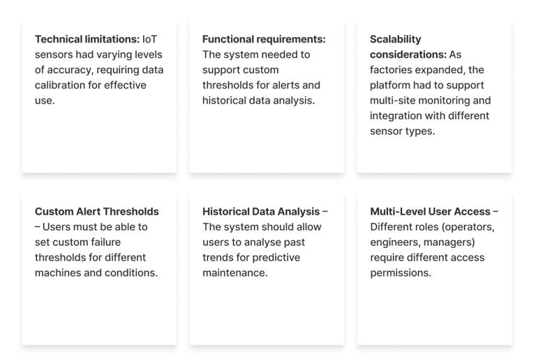
Stakeholder & Subject Matter Expert Workshops
To align business goals and technical feasibility, we facilitated workshops with IoT specialists, data engineers, and factory stakeholders. Key takeaways:
Technical limitations: IoT sensors had varying levels of accuracy, requiring data calibration for effective use.
Functional requirements: The system needed to support custom thresholds for alerts and historical data analysis.
Scalability considerations: As factories expanded, the platform had to support multi-site monitoring and integration with different sensor types.

UX Design
The Factory Monitoring Web App was designed with an emphasis on real-time monitoring, predictive analytics, and streamlined usability. Based on insights gathered from factory operators and engineers, the following solutions were implemented:
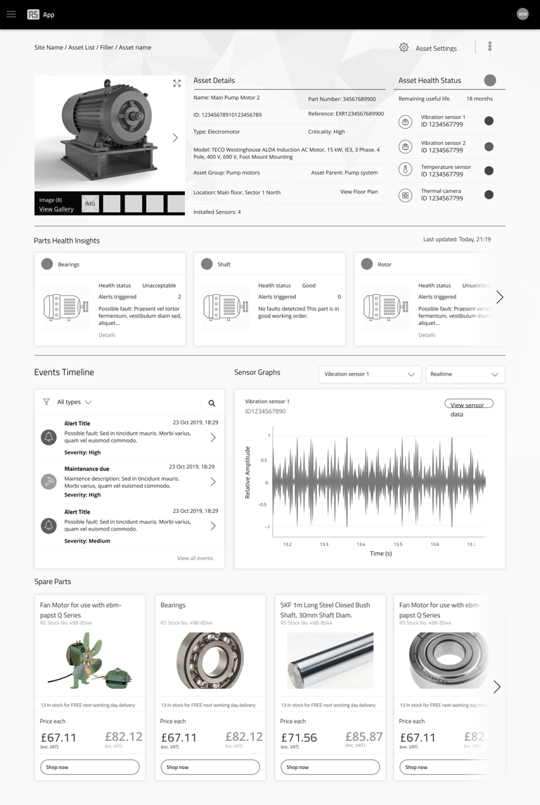
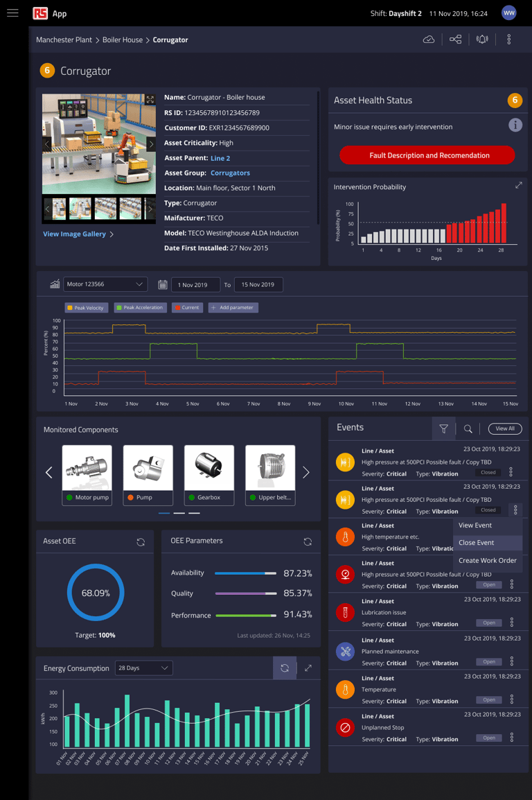
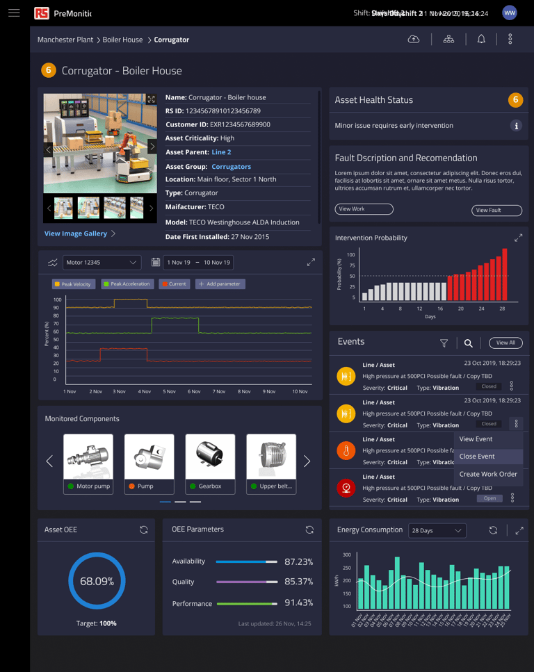
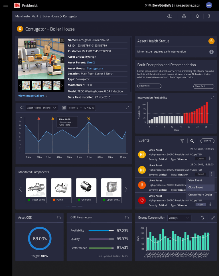
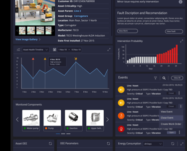
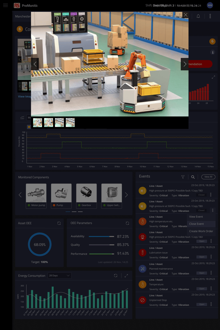
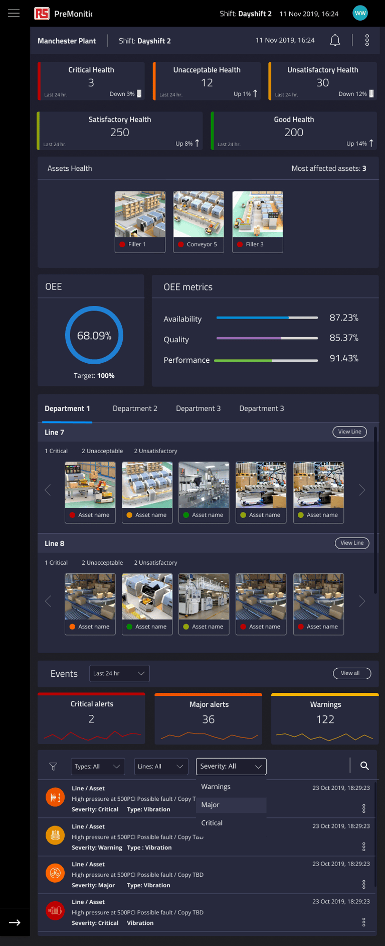
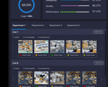
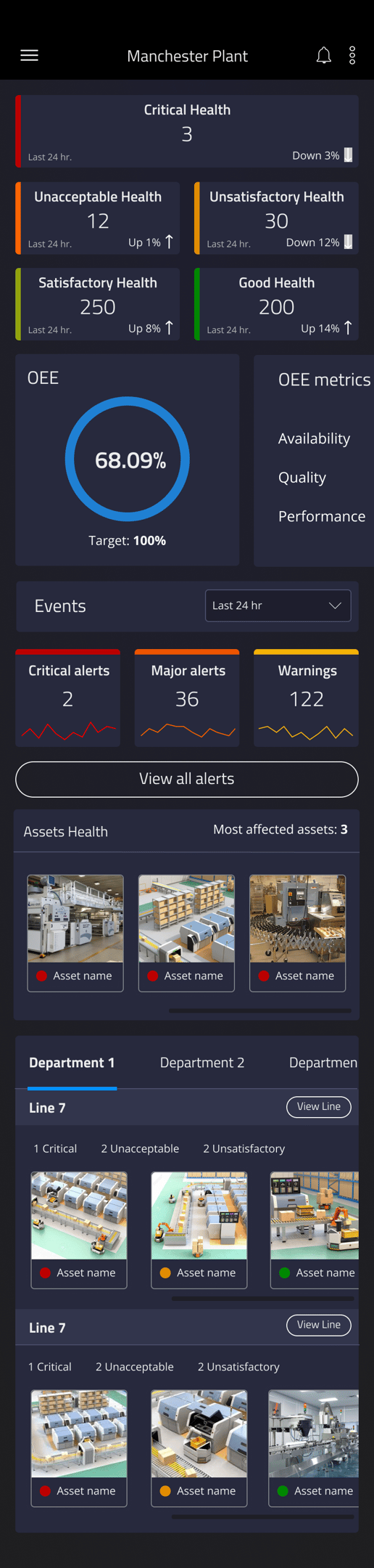
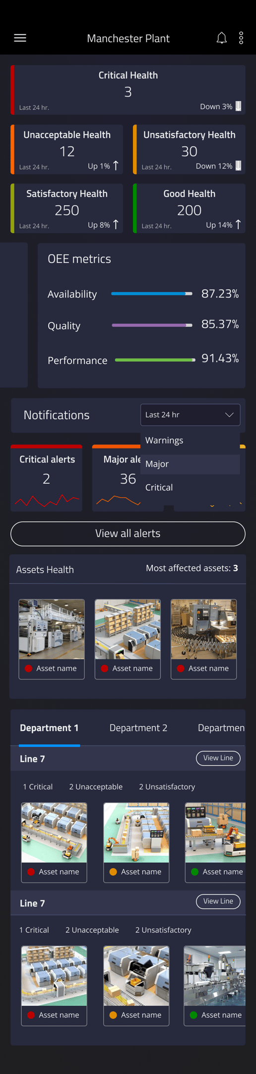
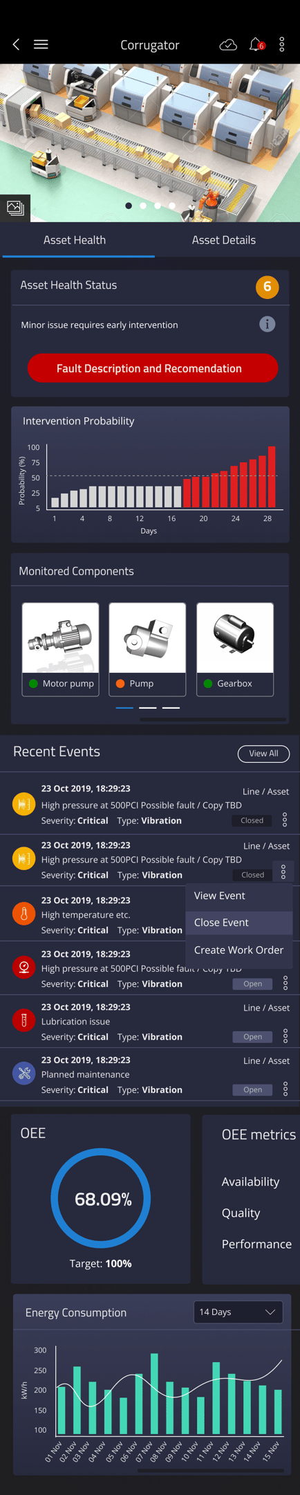
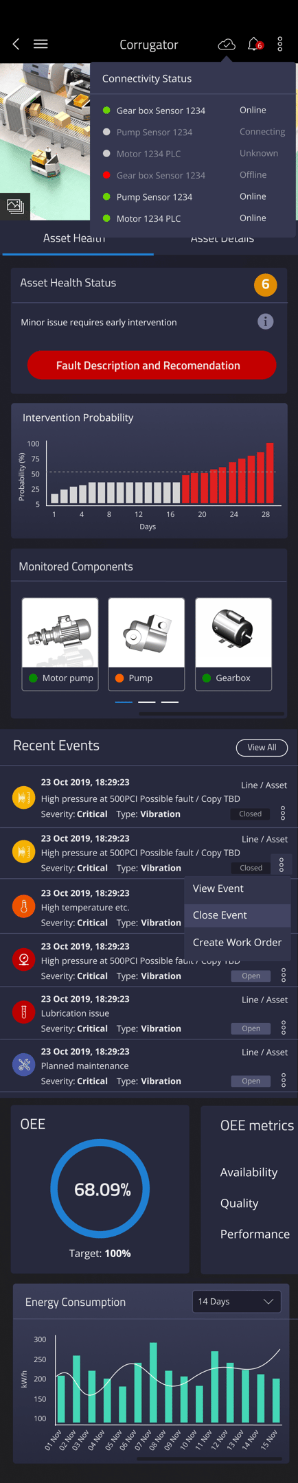
1. Real-Time Asset Monitoring Dashboard
Comprehensive asset overview: Displays machine health, operational status, and fault history.
Customisable widgets: Users can personalise dashboards with relevant KPIs.
Graphical data representation: Historical trends, intervention probability, and monitored components are visualised for easy interpretation.
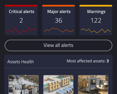
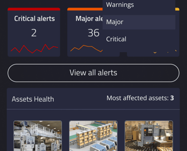
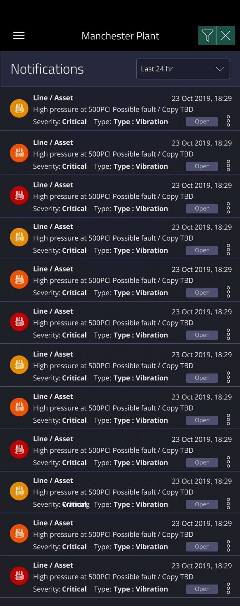
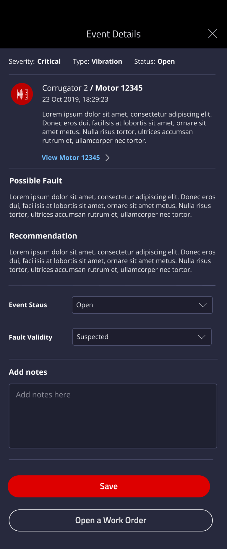
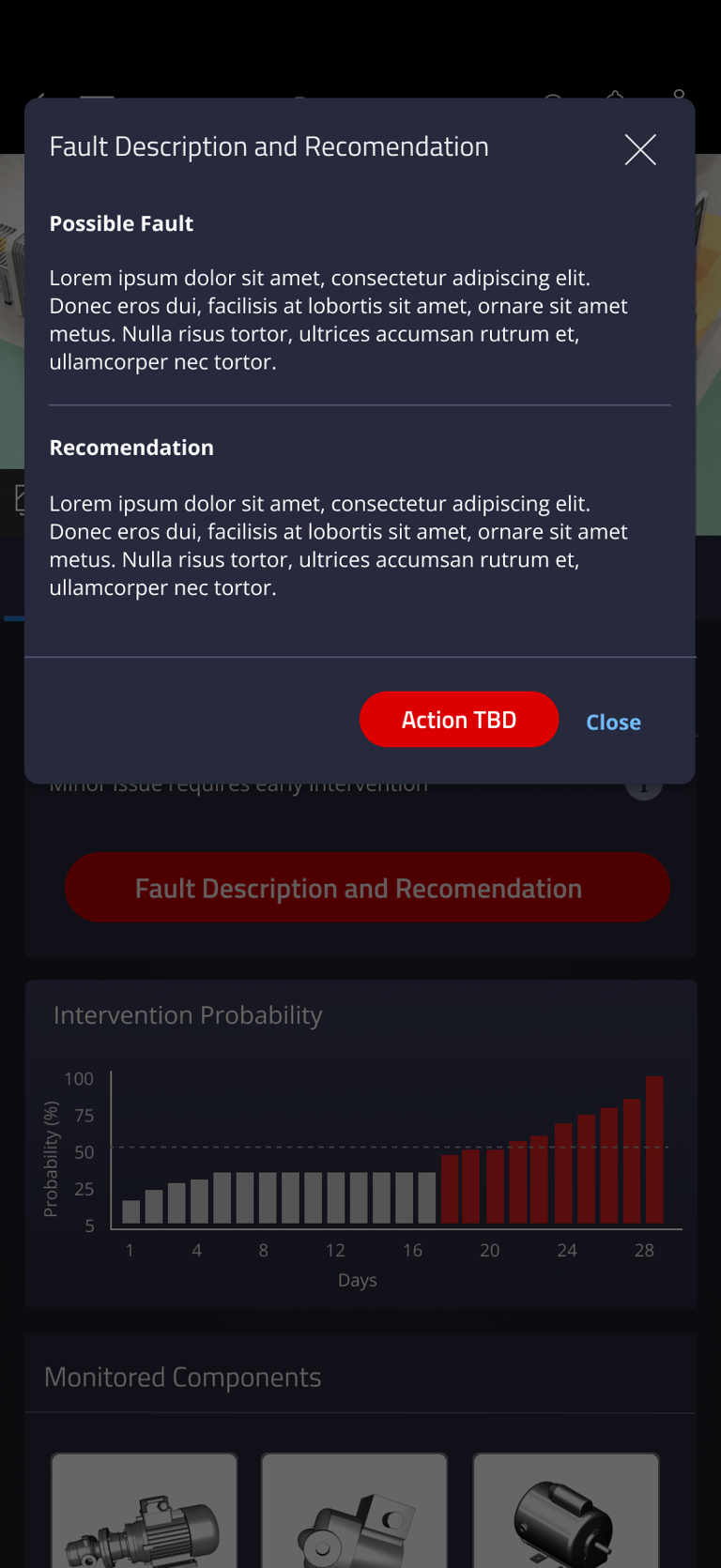
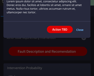
2. Alerts & Fault Management
Severity-based alert system: Categorises alerts by urgency (Critical, Major, Warning) for faster prioritisation.
Intervention probability graph: Helps predict failures based on past trends and machine conditions.
Integrated work order creation: Enables maintenance teams to log and track issue resolution directly from the alert panel.
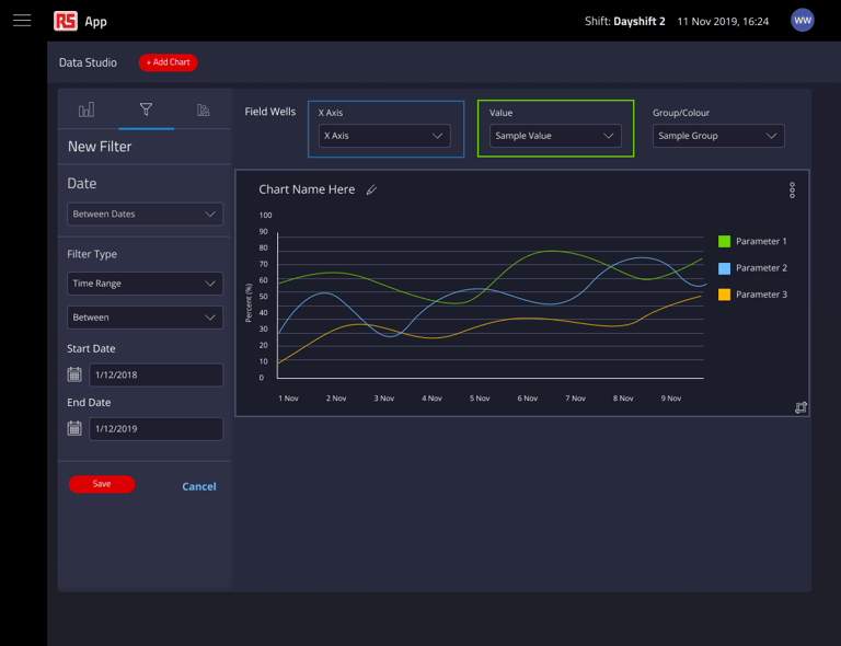
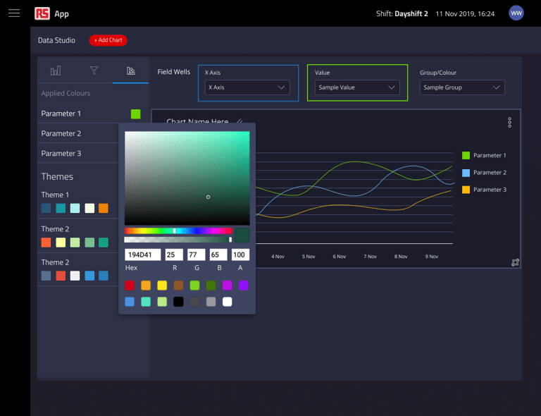
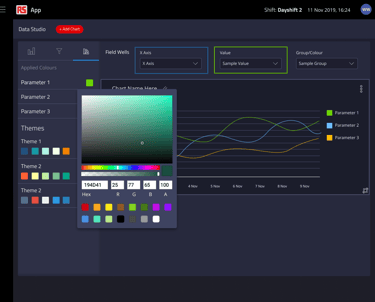
3. Data Studio – Configurable Insights
User-defined parameters: Allows users to select metrics, time ranges, and filters for custom graph generation.
Multi-variable trend analysis: Supports comparison of different sensor data points for better diagnostics.
Export and sharing options: Enables engineers to export reports for further analysis and collaboration.
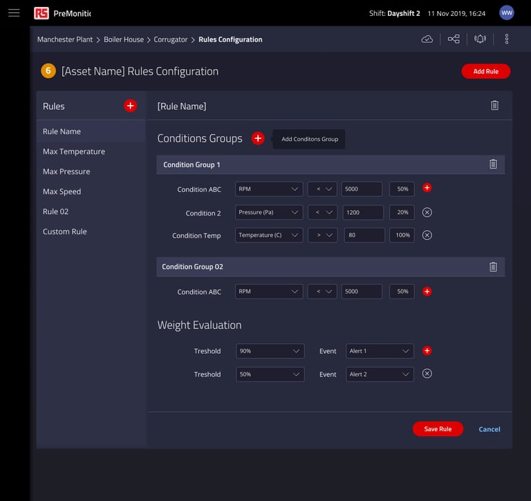
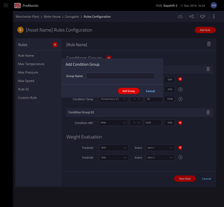
4. Asset Rules & Condition Configuration
Customisable thresholds: Users can define condition rules for automated alerts based on vibration, temperature, and pressure thresholds.
Conditional logic grouping: Enables complex rule configurations to refine alert triggers.
Scalable rule management: Allows for dynamic adjustments as new sensors and equipment are integrated.


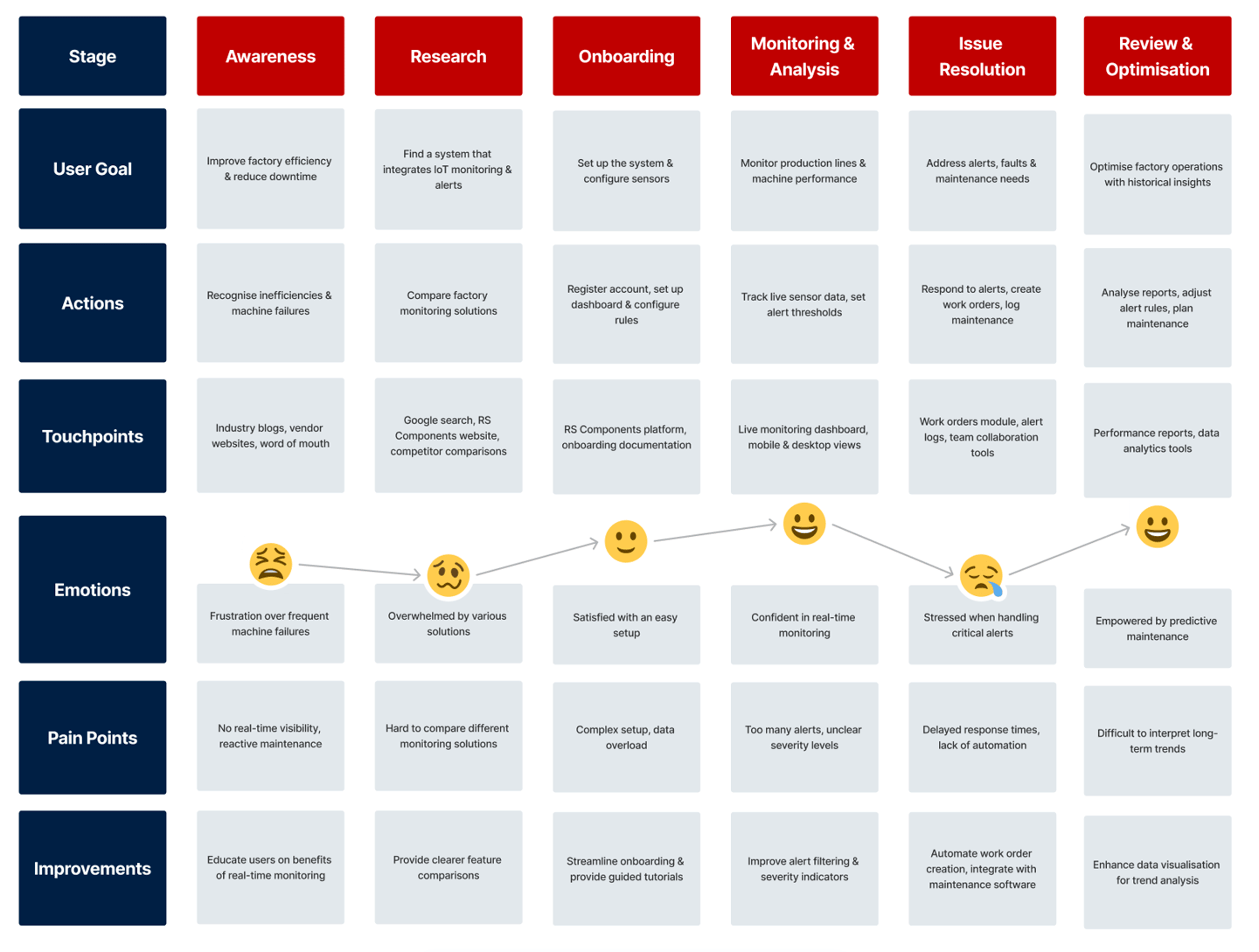
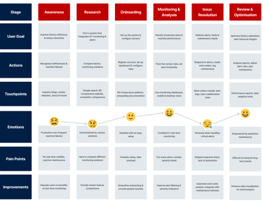
Customer journey maps
UI Design
Following the UX research and design phase, the UI design for the Factory Monitoring Responsive Web App was developed to transform user insights into an intuitive, efficient, and scalable interface. The focus was on ensuring clarity, usability, and adaptability, making it easy for factory operators, engineers, and maintenance teams to interact with complex industrial data in real-time.
1. Visual Hierarchy & Branding
A dark theme was implemented to optimise readability in industrial settings, reducing eye strain in low-light environments.
Consistent branding elements—including RS Components' colour palette, typography, and iconography—were applied to maintain a cohesive brand identity.
Typography: A clean, sans-serif font was selected for maximum readability on both large desktop monitors and smaller tablet screens.
Iconography: Custom icons were designed for key alerts, dashboards, and machine status indicators, ensuring quick visual recognition.
2. Dashboard & Data Visualisation
Building on UX insights, the UI layout prioritizes visibility and quick actionability:
Main dashboard design segments data into Asset Overview, Alerts, Graphs, and Monitored Components, ensuring clarity.
Interactive data visualisations:
Graph-based trend analysis presents real-time and historical sensor data for quick issue identification.
Multi-layered widget-based structure allows users to configure their dashboards based on their roles.
OEE (Overall Equipment Effectiveness) Metrics are displayed prominently, enabling operators to monitor factory efficiency in terms of availability, quality, and performance.
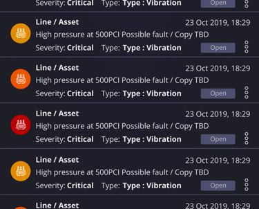
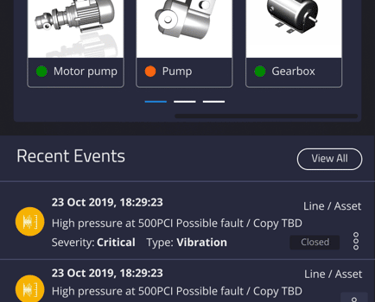
Events & Alerts Panel:
Displays alerts in a structured, severity-based hierarchy.
Allows quick responses via contextual action buttons (View Work, Close Event, Create Work Order).
3. Interactive Asset Management
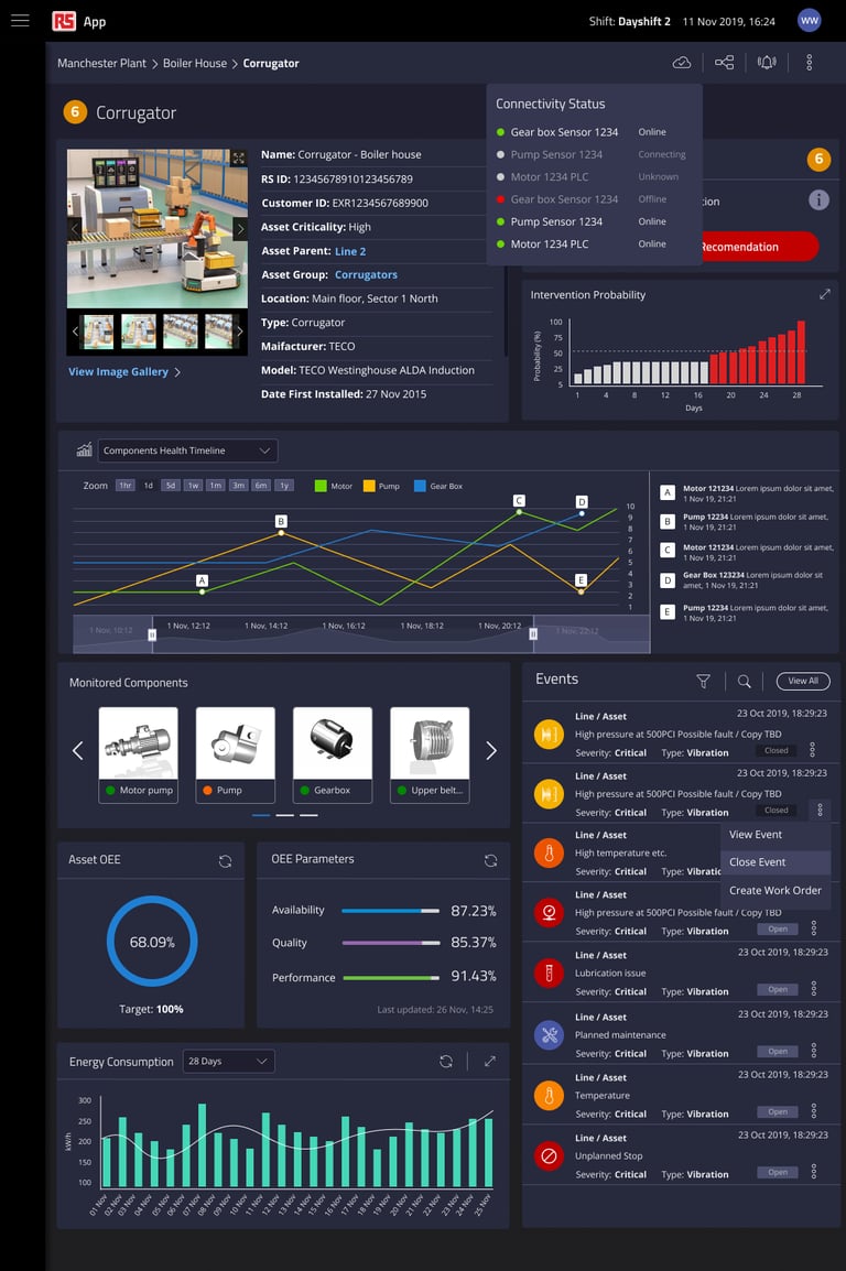
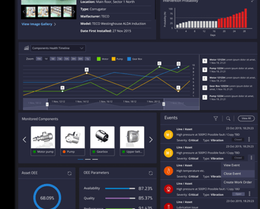
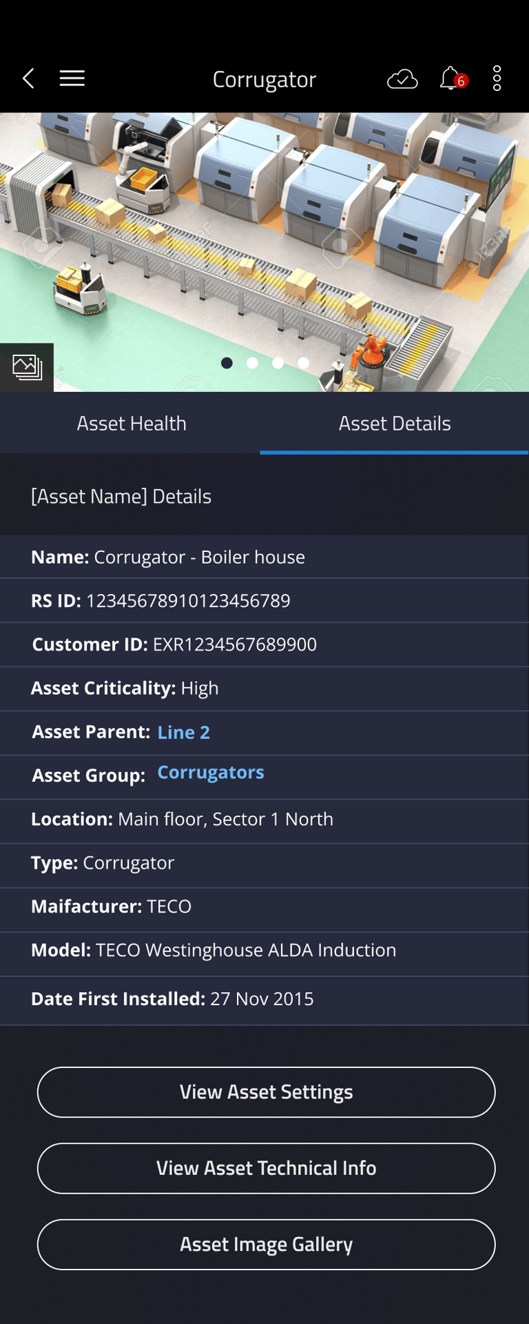
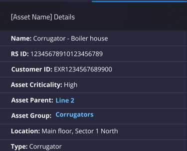
Asset information cards provide a concise yet detailed view of machines, including:
Machine name, RS ID, location, manufacturer, and first installation date.
Real-time health status and predictive failure probability.
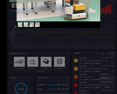
Component health tracking:
Machine parts are monitored individually, with colour-coded health indicators.
Components include motor pumps, belts, gearboxes, and pressure systems, each with real-time operational status.
Actionable insights UI:
Work order integration: Engineers can generate reports or schedule maintenance directly from asset status pages.
Live system updates ensure all data is always current.
4. Alerts & Condition Rules UI
Configurable condition rules:
Users can define, modify, and delete alert triggers based on vibration, pressure, temperature, and operational speed.
A logical rule-building interface simplifies the setup of conditional parameters.
Timeline-based visualisations:
Alerts are mapped against historical data trends to highlight recurring faults.
Engineers can adjust alert thresholds dynamically based on machine performance history.
Modular design for scalability:
As factories expand, new sensor integrations can be easily accommodated.
5. Data Studio & Reporting
Filter-based visualisation tools allow users to generate custom reports:
X-axis values, data parameters, and group comparisons enable deep insights.
Multi-graph comparison:
Overlaying different machine parameters helps analyze performance fluctuations.
Export & sharing capabilities:
Engineers can download reports, export CSV files, and share visual analytics with their teams.
Zoom and time-selection controls:
Allows for precise fault tracking across different production timeframes.
6. User Experience Enhancements
Sticky navigation & quick action menus:
Ensures essential controls (alerts, machine logs, reporting) are always accessible.
Collapsible side panels:
Maximises screen real estate for data visualisation on smaller screens.
Inline help and hover tooltips:
Supports new users with explanatory labels for complex analytics.
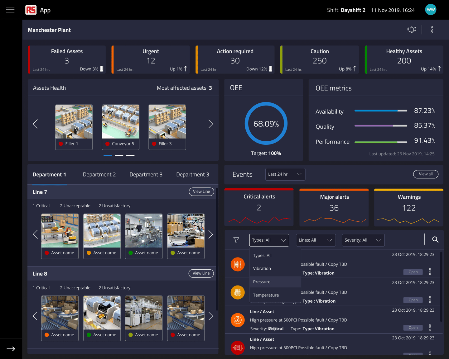

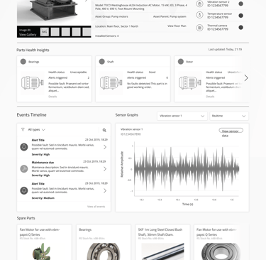
Main Dashboard
Asset Dashboard
Asset Dashboard
Asset Dash board
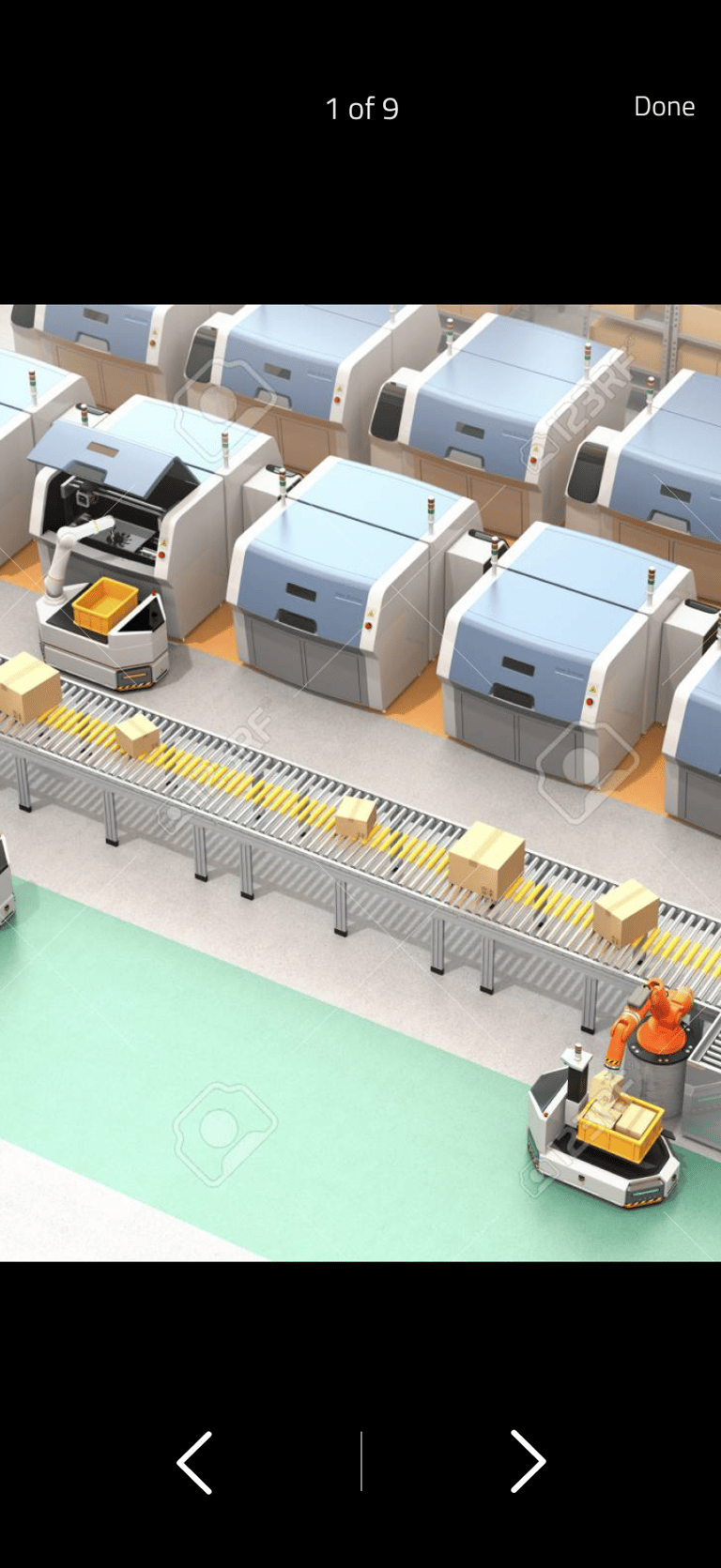
Image Gallery and Asset Health
Asset Configuration
Data Studio
Responsive UI Design
The platform was designed to be fully responsive, ensuring seamless usability on desktop, tablet, and mobile devices.
Adaptive layout reflow:
Panels dynamically adjust based on screen size.
Key KPIs are prioritised in mobile views to ensure quick decision-making on-the-go.
Mobile-first optimisations:
Alerts and asset statuses load instantly, prioritizing critical machine data.
Touch-friendly interactions for tablet-based field engineers:
Larger tap targets for buttons.
Gesture-based interactions for zooming and graph adjustments.

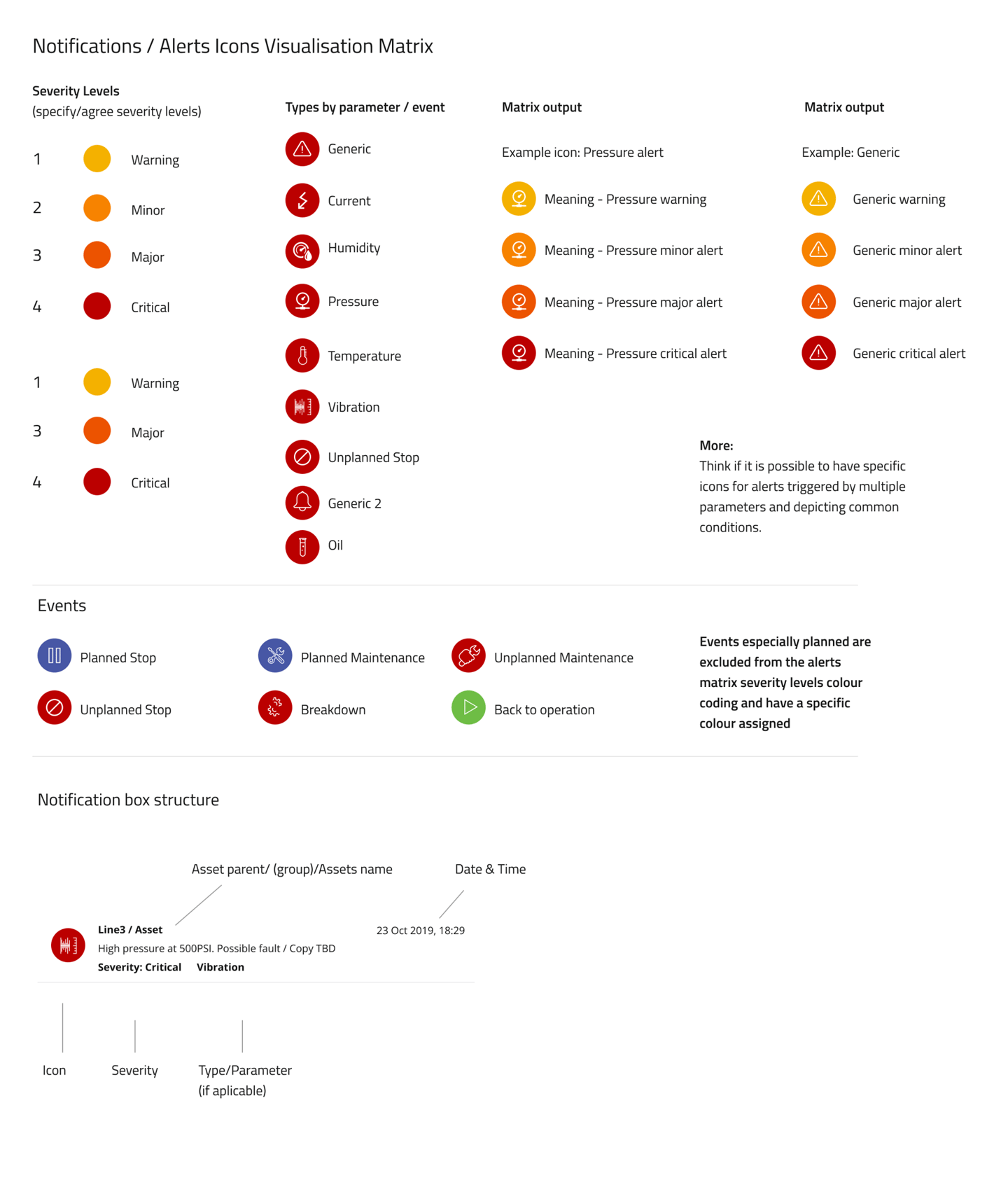
Asset Health and Alert Warnings Matrix
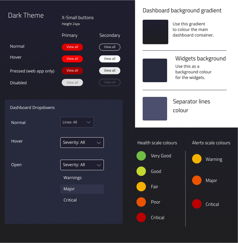
The Warnings and Asset Health Colour & Symbol Library was developed to provide a clear, intuitive visual language for monitoring machine health and operational status.
The system utilises a colour-coded severity scale, ranging from yellow (warning) to dark red (critical), ensuring users can quickly assess the urgency of alerts at a glance.
Each alert type is paired with distinctive icons representing parameters such as:
Vibration
Pressure
Temperature
Unplanned stops
This icon-based approach makes it easy to identify the root cause of an issue.
Planned maintenance events follow a separate colour scheme, differentiating them from unexpected failures to reduce alert fatigue.
The structured system enhances readability, prioritisation, and decision-making.
Maintenance teams can act swiftly to prevent equipment failures and optimise factory uptime.
Design Documentation & System Implementation
To maintain scalability and consistency, detailed design documentation was created, covering:
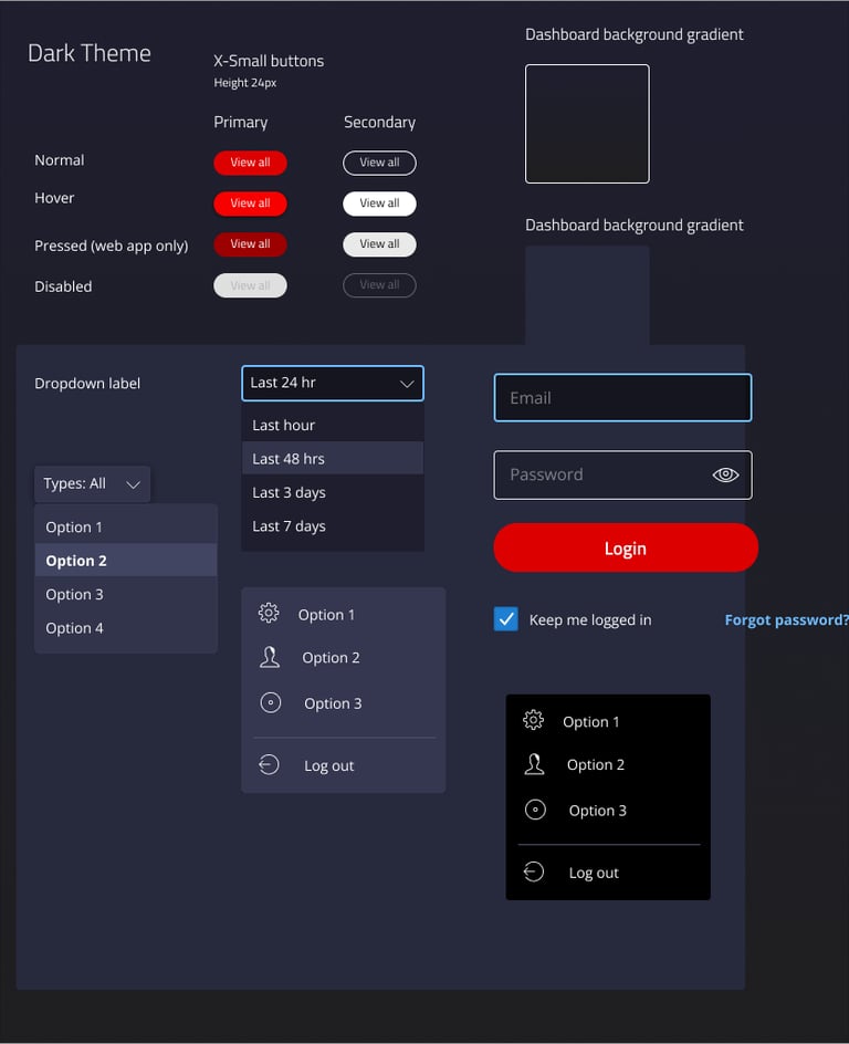
Comprehensive component library (developed in Figma):
Includes buttons, dropdowns, alerts, tables, graphs, and interactive cards.
UI style guide & design system documentation:
Standardizing typography, color hierarchy, component spacing, and responsiveness.
Interaction patterns & best practices:
Guidelines for alerts, modal dialogs, and multi-step workflows.
Accessibility compliance:
Ensuring high-contrast colors, keyboard navigation, and touch support.
Developer handoff specifications:
Pixel-perfect layouts, annotations, and redlines for implementation accuracy.

Impact
Improved efficiency – Operators gain real-time insights, reducing unexpected machine failures.
Optimised maintenance cycles – The alerts system helps factories transition from reactive to predictive maintenance.
Seamless user experience – The responsive design ensures usability across devices.
Clearer data visualisation – Customisable dashboards and interactive graphs enhance decision-making.
Lessons Learned
On-site observation is invaluable – Understanding factory workflows first-hand led to better design decisions.
Customisation matters – Users wanted personalized dashboards tailored to their roles.
A clear visual hierarchy is essential – The health state color scale significantly improved usability and response times.
Cross-device accessibility drives adoption – Ensuring a great experience across desktop, tablet, and mobile was key to user engagement.